The experts on global warming have built their charts based on empirical data from the deep snows of Antarctica. A lot of work goes into gathering and displaying these data and it gets published in places most citizens don’t read or see. The published information can get very detailed and hard to follow and may lead to skepticism. Well here is something that might be a little more understandable.
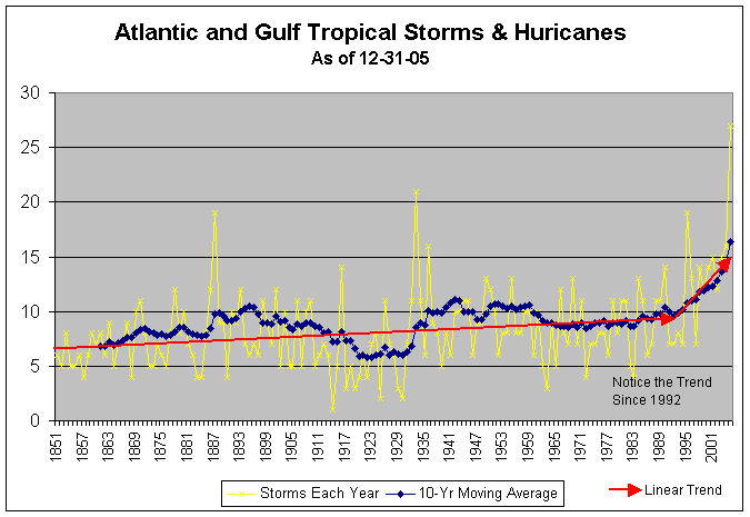
There probably aren’t many people that have not heard about the recent hurricanes, their strength, and the horrific disasters that followed landfall. Most probably know from their local weather person, that hurricanes get their strength from the waters they form over and eventually die after they hit land. Most probably know that the storms are named from an alphabetical list that changes each year. What most probably don’t know is how the number of named storms has changed over the recent past. The chart below provides a view of that change – and it is quite dramatic.

Click on image for full size display
Is our world getting warmer or not?
The graphic above was researched and developed by Jim Vogas, a coauthor for this blog.
Scientists say they are observing increases in the windspeed and the duration of hurricanes — though not necessarily the total number of storms


Pingback: The WAWG Blog » Shrinking Sea Ice Area Helps Promote Record Hurricane Season